Building a resume is a process that requires finesse. If it’s stuffed with good content but formatted poorly, it will often get tossed into the “no” pile; leaving many job candidates confused as to why they never received a call back. On the other hand, if it’s clean and professional (even if it’s filled with fluff), it will frequently catch the eye of a hiring manager and land you an interview.
Although content is ultimately the most significant element of your resume, it’s important to not underestimate the power of appearance. The reason we need the adage “don’t judge a book by its cover” is because we do judge things by their appearance frequently, whether we like it or not.
This guide will help you take advantage of that fact. Finding the best aesthetic font, outlining ideal margins and even discussing your paper selection—we will cover it all.
1. Best font for a resume: Style, size & color
Creating a clear, succinct resume requires multiple elements working in harmony. For this to happen, one thing is certain: don’t use Comic Sans. Choosing an aesthetic font might seem daunting, but it doesn’t need to be. People often ask us: is there a best font for a resume? We’ve crunched the numbers, and we have an answer. The best font for a resume is…
Style
Tricked you—there isn’t truly a single best font, but there are several options that stand out amongst the rest! We will give you some solid choices and you can take it from there.
First, consider this: how will you be sending your resume? Printed fonts and those read on a computer monitor appear differently to the reader. There are two key groups of fonts used globally: serif and sans-serif (i.e. “non-serif”).
Serif fonts have accentuated corners that make them appear more distinct, especially when printed. Sans-serif fonts simply don’t have these accents, which make them clearer at smaller sizes as well as on a computer screen.
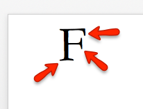
Keep these ideas in mind when constructing your resume. Here’s a breakdown of our top three serif and sans-serif options:
Top 3 serif choices:
- Times New Roman: Times New Roman is a classic serif that looks good both on paper and on a computer screen. It’s a safe, standard choice for any resume.
- Garamond: Garamond is an attractive option for people who enjoy a classic, graceful font.
- Georgia: Georgia is also a popular choice. Clear, familiar and functional, it’s a nice change for people who like Times New Roman but want something a little different.
Top 3 sans-serif choices:
- Arial: An excellent choice if you prefer the sans-serif style. It is easy to read, and familiar to many people due to its appearance on commonly used web applications like gmail.
- Calibri: Popular amongst professionals. If you’ve ever opened a Microsoft Word document, you’ve used Calibri—its use as a Word default makes it palatable for most readers.
- Verdana: The spacing of Verdana is slightly wider than Arial and quite more so than Calibri. Choose this style if you’re aiming for ease-of-reading.
Size
Font size is another area that you’ll need to play with to find your ideal option. Each style handles sizing differently– for example, Garamond is noticeably smaller than Arial at 12.
Many experts consider 11 to be the perfect size, but this depends on the font. The most important thing is that it’s clear and large enough to read. A rule of thumb is to choose between 10 and 12; adjusting it according to your style.
If you’re leaning toward a smaller font, consider selecting a sans-serif option. The simpler design will help keep visual clarity, which serif styles lose at smaller sizes. Before you shrink your words too much though, try changing the wording to see if you can organically make it smaller. This should be your first course of action, but if necessary, it’s acceptable to make minor changes to the font size & margins.
Color
The majority of resumes use a standard black and white format. There is a reason for this– bright colors are distracting and take away from your actual content.
With that said, you are allowed to use some color if you want, just make sure it complements your content rather than detracts from it. Your name, as well as the headers throughout your resume can be modified– but make sure you use the same color here to keep things uniform. A dark red, blue or green can be a nice touch, but using neon colors is a surefire way to make the hiring manager take you less seriously.
2. Resume margins, length & alignment
The size and shape of your resume are just as important, if not more so, than the font. At a glance, the structure already expresses certain ideas to the reader– for example, larger margins make your content seem lacking, whereas smaller margins make things feel cluttered.
You don’t want your resume to get noticed for its formatting. Playing it safe is advisable. Avoid extremes and you’ll be in good shape (pun intended).
Margins
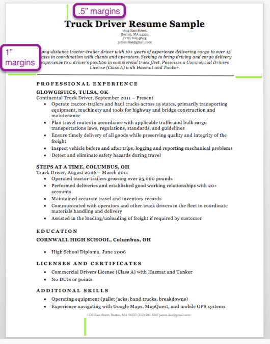
Standard one inch by one inch margins are a good choice, but you do have some flexibility. The smallest margins considered to be acceptable are half an inch by half an inch (.5 by .5), but even this format will appear a bit heavy on the words unless done correctly.
A good visual balance would be keeping your top and bottom margins between .5″ and 1″, and moving between .6″ and 1″ for your left and right margins. This will help decrease reader fatigue and make your resume more palatable for whoever is looking at it. Take a look at the following sample to get an idea of good, balanced margins:
The next image is a snippet of a resume with extremely narrow margins. Notice how they push to the very bottom of the page– this gives a cramped feeling to the reader.

Length
For most people the ideal resume length is one page, using reasonable margins as discussed above. Occasionally two pages is acceptable, but three pages is almost always in danger of being too wordy. Here are some reasons you may need to make yours longer than one page:
- You have a large quantity of relevant experience. Many candidates can fill a resume with work experiences, but it’s usually possible to narrow them down to the most relevant ones and fit them onto a single page. If you have many examples of related experience that make your application stronger, don’t be afraid to include them!
- You are a published scientist or academic. Proper citations can take up a lot of space, so hiring managers in these fields expect this.
- Landing an executive position is your goal. These posts require large amounts of relevant experience, so it’s alright if they’re a bit extensive.
Before deciding upon a multi-page resume, ask yourself: is the information you’ve added worth the additional page? Or will the hiring manager find it unnecessary?
Your resume is a tool to efficiently convey your qualifications to a potential employer so you can proceed to the interview process– you don’t need to list every piece of work you’ve ever performed. Quality is more important than quantity.
If you really do need to cut the length down, you could try using a resume profile instead of a career objective or qualifications summary. Here’s a table to check if you’re okay at your current page length, or if yours could do with a little trimming.
| One Page Resumes | Two Page Resumes | Three Page Resumes |
| Precise & efficient | Contains a wide array of experiences and abilities | Includes a great quantity of information—skills, achievements, publications |
| Easier for the hiring manager to keep track of | Might seem bloated to some hiring managers if done poorly | Could probably be trimmed down by most people (remember: relevant experience only) |
| Popular for applicants ranging from inexperienced teenagers to mid-level professionals | Best for applicants who are citing their published work, or have substantial experience in an industry | Most appropriate for executives, academics or engineers |
Alignment
The best alignment makes your resume easy to read. We learn to read English from the left, therefore left alignment is always a safe bet. Your name and contact information is usually centered, but the headers (“Professional Experience”, “Education”, “Additional Skills”) and your introduction/objective can be left aligned or centered. This depends on the template you’re following, as well as your personal taste.
3. Style Elements
Another way to accent yours is to use style elements like lines, symbols and text boxes. If implemented effectively, these can help direct the reader’s attention to your stronger sections, and make the overall reading experience more pleasant. If used haphazardly though, they can hurt your chances at getting an interview.
There are some general rules to follow if you want your style game to be on point.
Lines
Lines, like many things, must be enjoyed in moderation. Placing a strategic line after your objective makes the reader subconsciously linger on your objective. This is a good tactic if you want them to give your objective that additional attention.
Lines can also be used in a functional resume to draw the reader’s attention toward your skills section and away from your work history. Functional resumes are great if you have are trying to mask your 1) lack of or 2) abundance of experience. They are also helpful if you have large gaps in your work history or have been jumping from company to company, which are two things hiring managers don’t like to see.
Whether you’re inexperienced, over-experienced or just have a tendency to job-hop, you can use our wide range of free career and life situation resume templates to learn how to cover employment blemishes and emphasize your strongest areas.
Symbols
Pugs are cute, but this is not the time to put a clip art image of an adorable little Pug puppy on your Veterinarian resume. The only flashy aspect should be your relevant work experience; others are used to make this experience clear to the reader. This holds true for symbols.
Bullet points come in different shapes and sizes, and are the primary symbol used in a resume because they draw the hiring manager’s attention to your achievements and skills. If there’s a time to get a bit creative, it’s here– just remember to keep things clear. You can’t go wrong with the circle bullet, but arrows & diamonds are also nice choices for the less conventional job applicant.
Text boxes
Some experts advise against text boxes because they are worried the Applicant Tracking System (ATS) will skip over the content placed inside, but this bias is a bit outdated. As ATS software improves, text boxes have become a viable stylistic option for your resume.
If you’re feeling conservative then feel free to steer clear of them, but if you do want to use a text box or two (or several), go for it! Text boxes can be an ally in your quest to achieve aesthetic harmony.
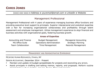
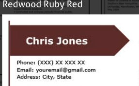
One way a well-placed text box can help your resume stand out is by emphasizing certain pieces of information, like your name. Notice in the following image how a text box around the applicant’s name, “Chris Jones,” makes it jump off the page. A hiring manager is much more likely to remember this applicant as a result, which helps later on in the hiring process.
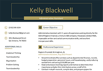
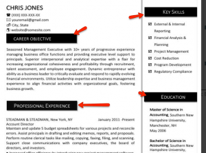
Text boxes also make your content clearer to the reader because they help break information into reasonable chunks. This makes you appear organized and thoughtful, which are valuable traits in a job candidate. They also improve overall readability. Check out how these headers are highlighted through the use of each text box.
Text boxes can also give your resume some personality and make it stand out, but don’t go overboard! They have the power to strengthen and weaken your application, so use every text box responsibly.
4. Resume paper: Color, weight, size & texture
Woah, now. Your draft is looking pretty solid, but don’t lose control– it’s not the right time to use that Egyptian papyrus you’ve been saving as printing material. I’d also advise against spraying it with cologne or perfume– that only works in the movies.
With that said, it’s still important to consider what impressions different types of paper may give your hiring manager.
Paper color
The paper color of your printed resume should be some shade of white or off-white; avoid colors like baby blue or hot pink unless you’re applying to be the Easter Bunny. Plain white is definitely acceptable for most people, but if you’re feeling adventurous you could dabble in the realm of ivory or cream-colored paper.
Off-whites stand out a bit from run-of-the-mill paper, without standing out too much. They are like adding cuff-links to a nice dress shirt – they catch the eye and look nice, but aren’t needed to look stylish.
Paper weight, size & texture
Have you ever felt 100% cotton, 32lbs linen paper? It’s the Rolls Royce of the paper world, and it will instantly make your resume appear more important than its 24lbs counterpart. It’s soft yet sturdy, and gives the holder a strong urge to never let go.

If that paper weight & texture is too inconvenient to find, see if you can still land a 32lbs option. 24lbs is better than your standard printer paper, but not by much. Use some serious paper to show that you’re a serious job applicant.
Conclusion
There are many factors that can make or break your resume, and we’ve just covered the visual elements. If it’s well-honed, it can be a valuable tool during the job hunt. Try not to underestimate the importance of good aesthetics! If you’re ready to start, you can take a look at our free resume templates, or use our free resume builder to construct a professional resume in minutes.
